The Challenge
Name towels on Rakuten all looked alike: embroidered, minimal, mostly text. CREVASSE wanted to
bring something new to its shop, built from two things it already did well: full-colour
sublimation towels and printed apparel.
My research showed a clear gap. Nordic-style illustration, full-surface printing and name
personalization together were almost absent from the market. Sublimation on poly-cotton can't
beat cotton on absorbency, so instead of fighting the material, I positioned the line as a
personalized gift and keepsake rather than a functional towel.
The Cast
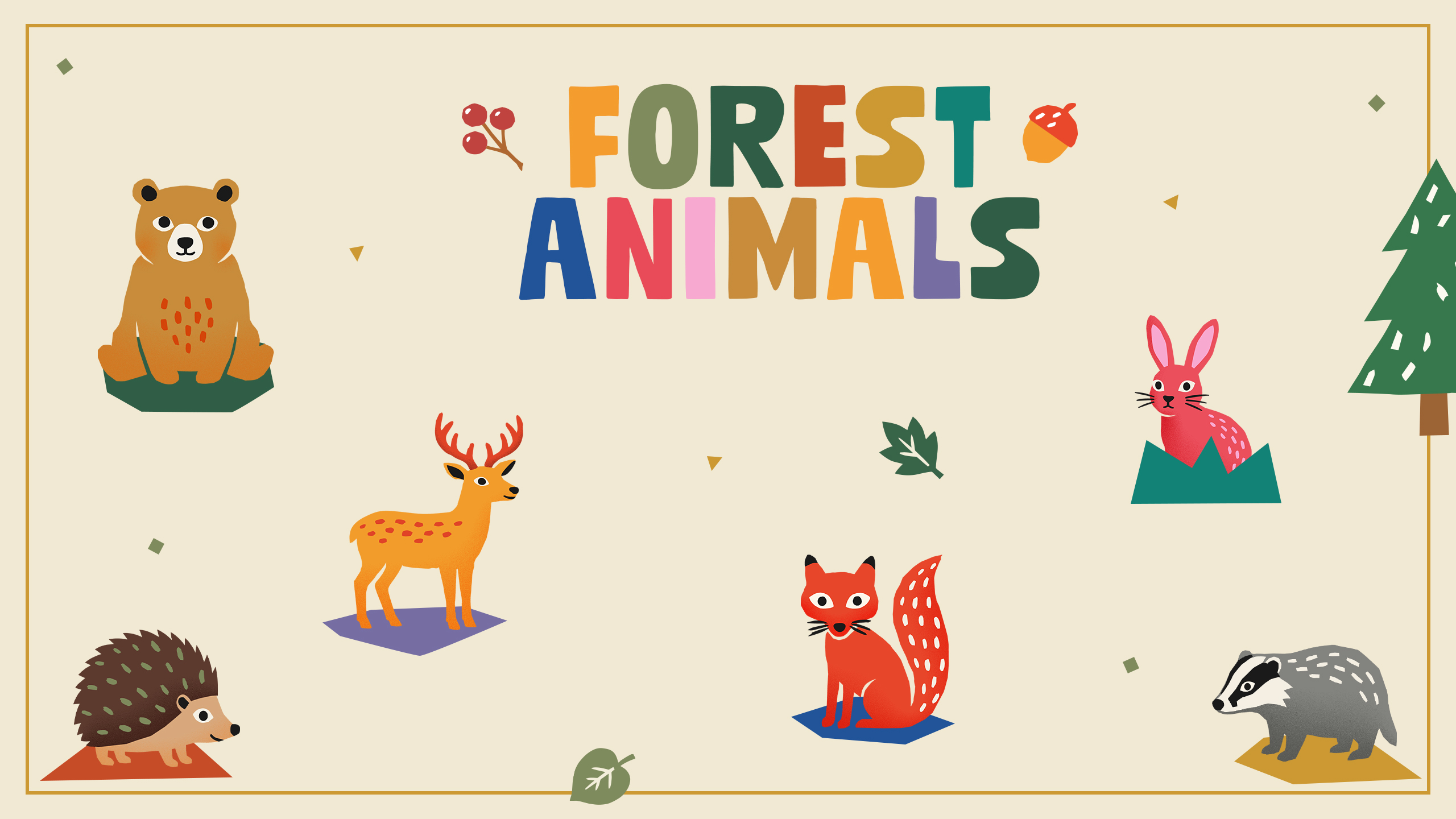
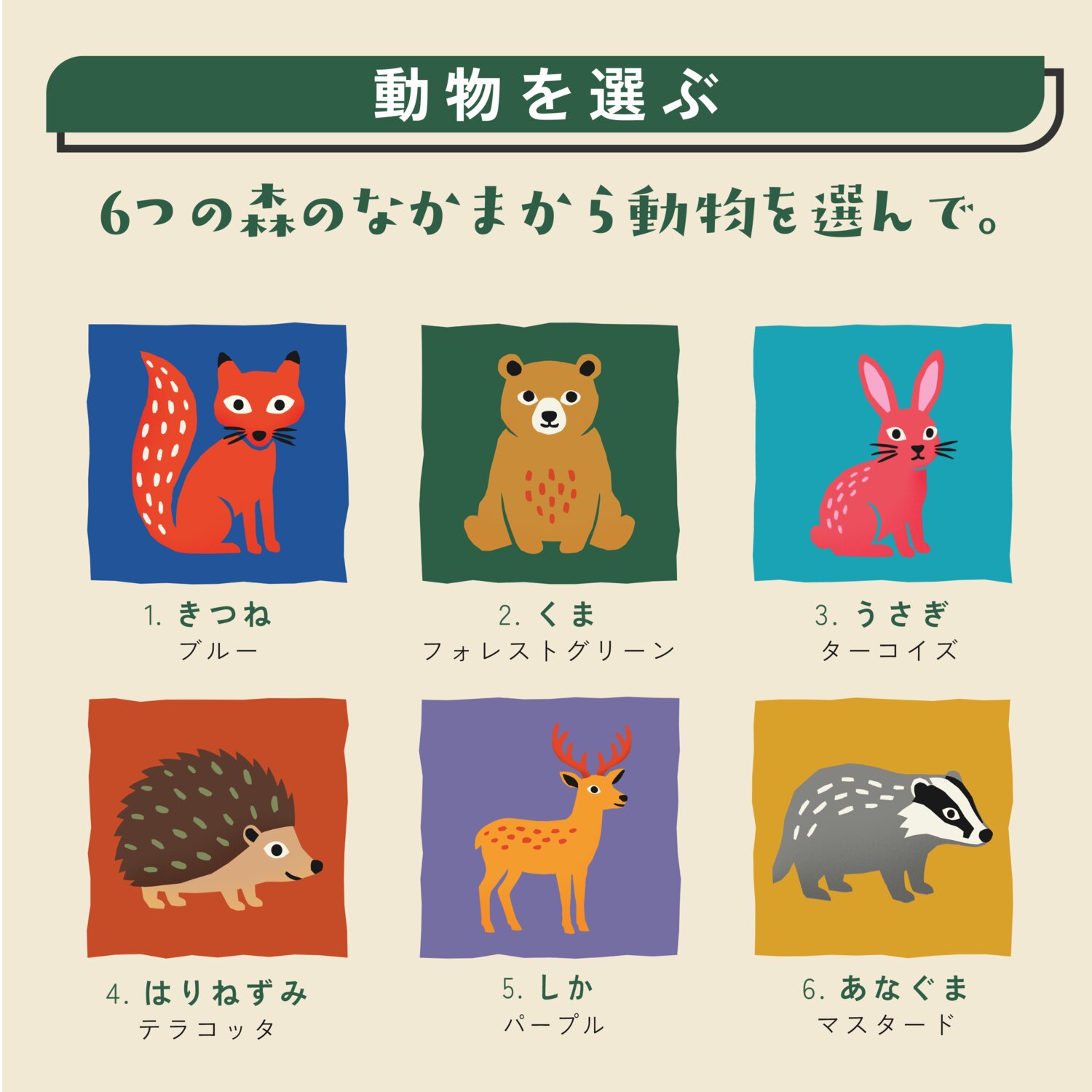
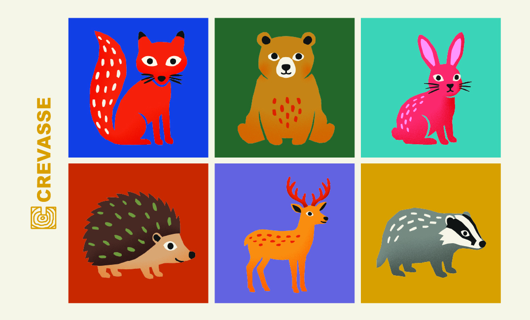
Six animals, each in its own colour. Together they give the shop a whole family of
characters to collect.
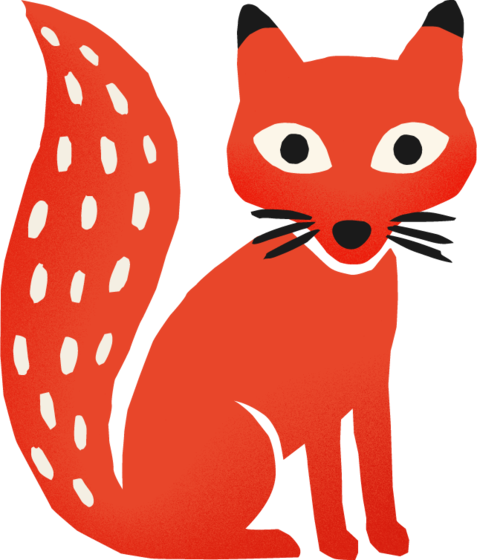
Fox
Blue
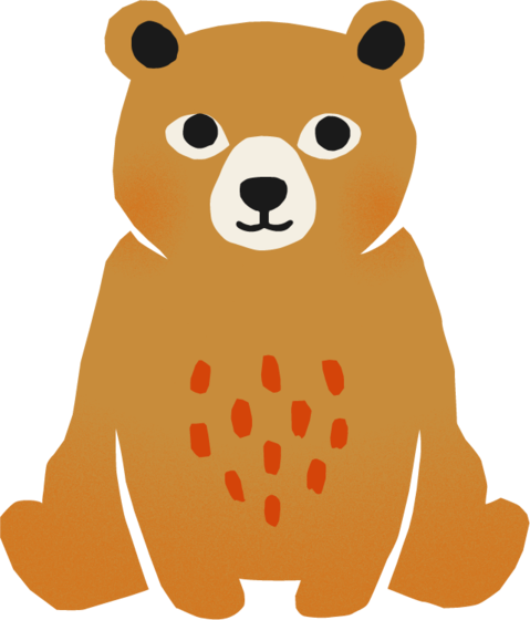
Bear
Forest Green
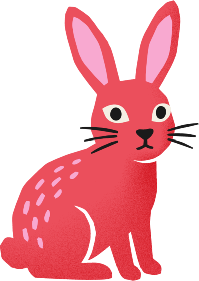
Rabbit
Turquoise
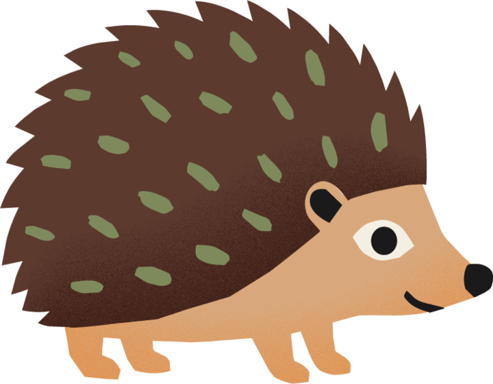
Hedgehog
Terracotta
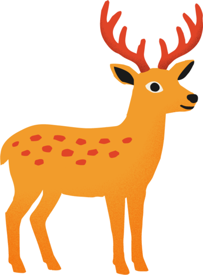
Deer
Purple
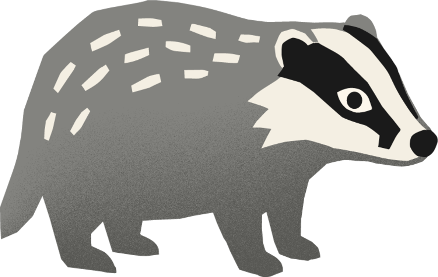
Badger
Mustard
Name System
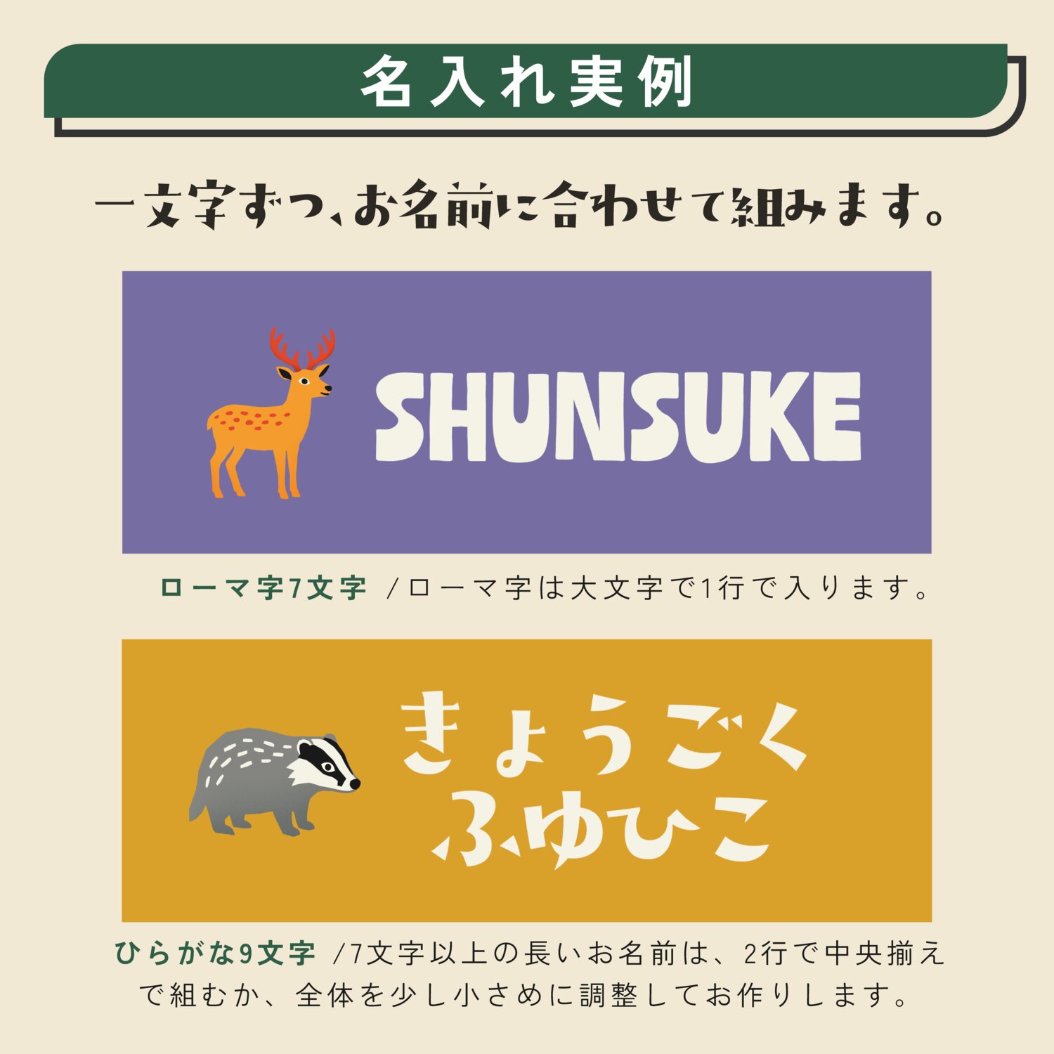
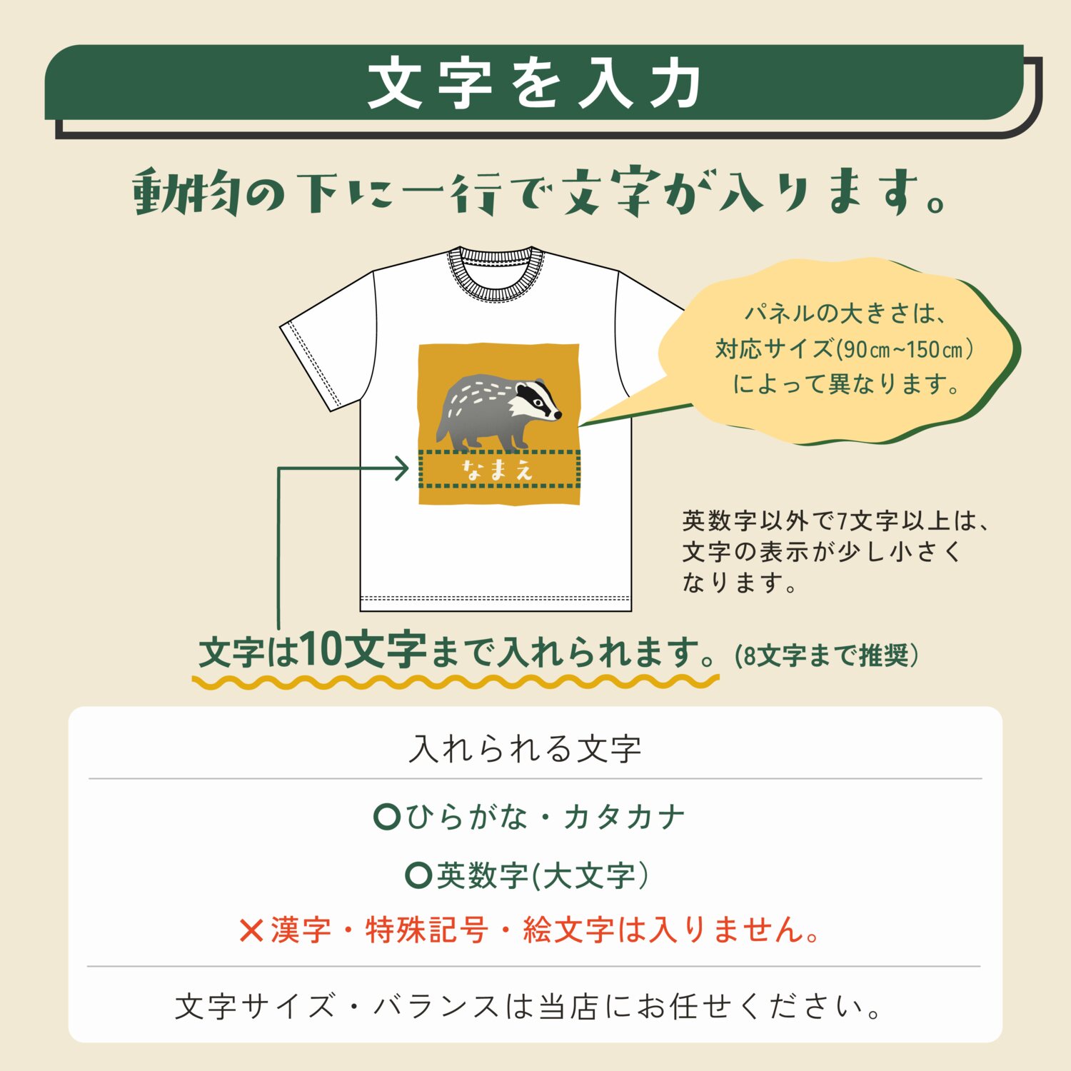
A flexible lettering rule keeps every name looking balanced, whatever its length and
whichever animal it sits with.
This is where my game UI background mattered most. In a localized game, one button has to work
in English, French and apanese, and other languages. A name on a towel has the same problem: 「りん」 is two
characters, 「しんのすけ」 is five, and TSUMUGI is seven Latin letters. Every one of them has
to look intentional.
So I built the template like a localized UI: font size and tracking rules for every character
count from 2 to 10, set separately for hiragana, katakana and Latin, inside a six-artboard file
with clearly named layers. The Japan team can fill any order without making a design decision,
and the same system later carried into the T-shirts, the sweatshirts and the shop's next
product, a birth keepsake towel.
Typography
Choosing the typeface took longer than anything else in the project.
It had to match the paper-cut illustrations, pair kana and Latin letters naturally, and stay
beautiful with any name a customer could type, including dakuten, small kana and long romaji.
After testing many candidates against the same set of tricky names, I paired Mudstone Sans
Black for Latin with ADS-Sanpopo for kana.
Product Range
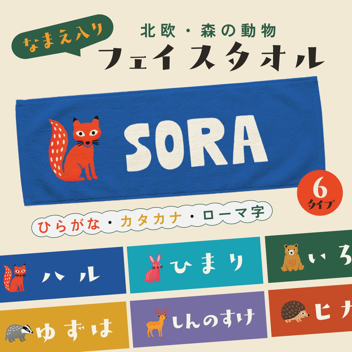
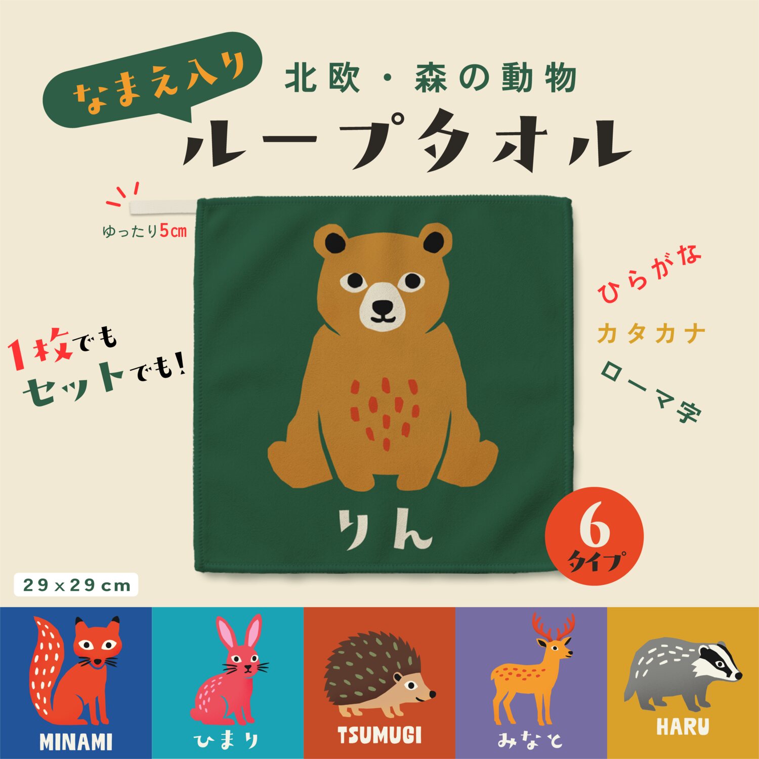
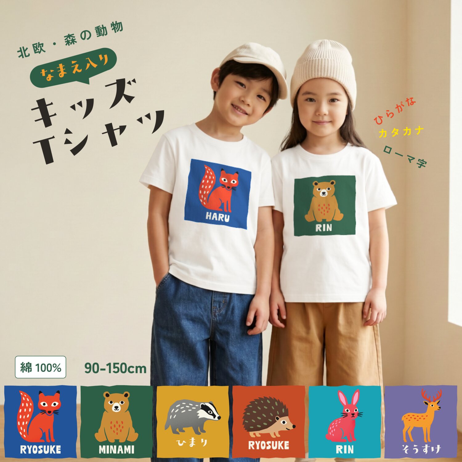
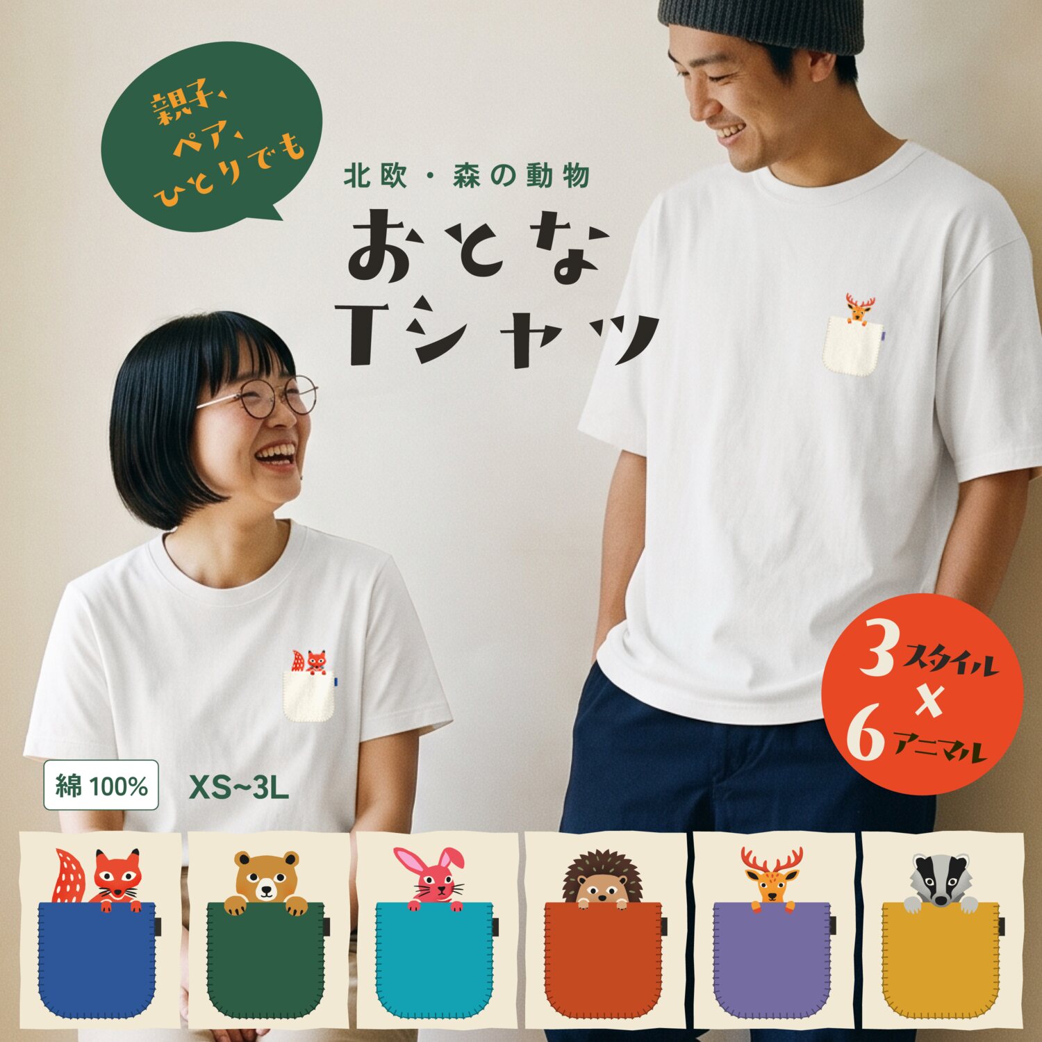
The towels are printed by dye-sublimation and the clothing by DTF, so the artwork had
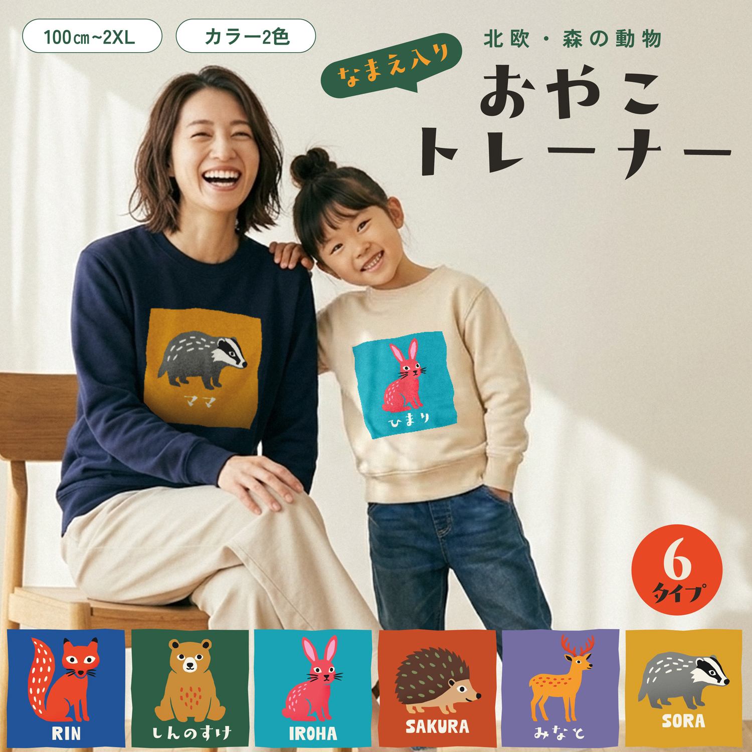
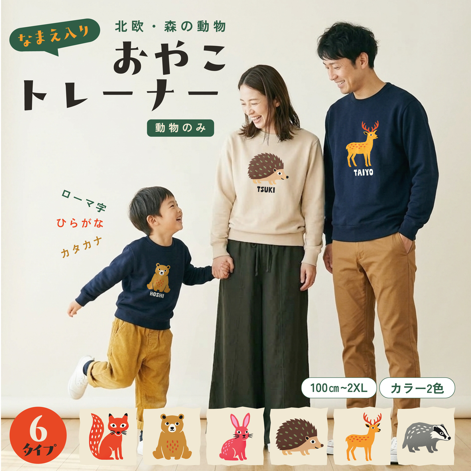
to sit cleanly on every material. The range launched in stages to match the sales calendar: towels
first, then T-shirts, then matching parent-and-child sweatshirts for winter gifting.
Print Details
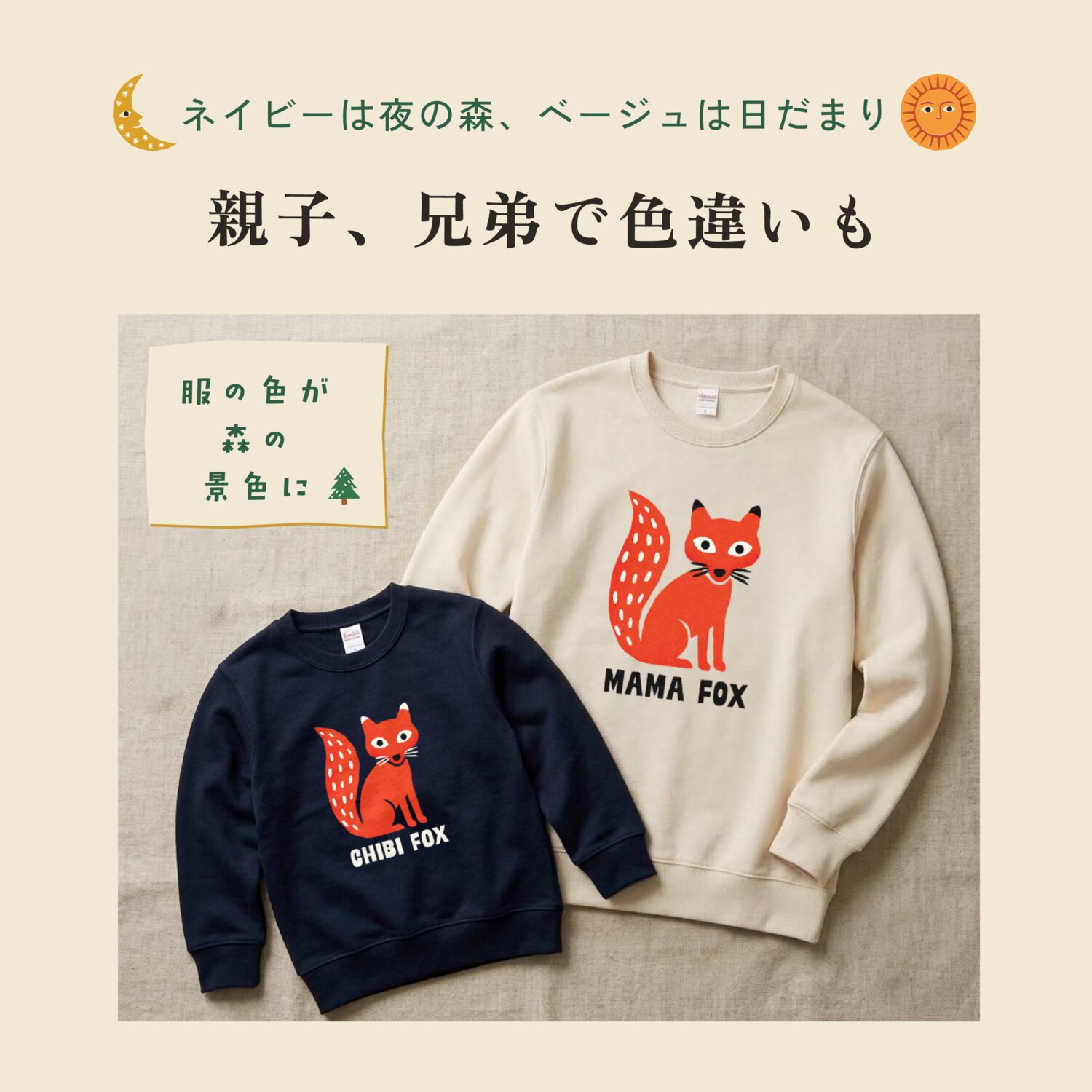
The same artwork doesn't read the same on every fabric. On the deep navy body, the fox's
black ear tips and whiskers disappeared into the background, so I switched them to ivory
and set the name in ivory too. On the light beige body, the name stays black.
Each body colour gets its own version of the file, so the character keeps its shape and
contrast whichever colour the customer picks.
Remote Production
Designing physical products from the other side of the world.
I worked from Montreal while production happened in Japan, so I couldn't hold a single sample.
We built a simple loop instead: the team printed tests and sent me photos, I reviewed them and
adjusted the files. Together we checked colour on fabric, the length of the hanging loop on the
hand towel, and the smallest detail that still survives DTF printing at the smallest print
size.
Landing Page
On the store page, shoppers pick an animal first, then type in a name to personalize
it.
With no photo studio in Japan, I created the lifestyle scenes with AI image generation (Recraft)
and finished them in Photoshop, following one art direction across the whole series: natural
light, relaxed poses, a calm catalogue feel. The illustrations themselves were all drawn and
finished by hand as vectors.
Workflow Tool
Designing for the team, not just the customer.
Rakuten limits image file sizes, and exporting dozens of page images by hand was slow for
everyone. I built a small batch tool on ImageMagick, refined over many rounds with Claude Code, that
converts, compresses and renames images to the shop's naming rules in one step. Fewer manual
steps for the Japan team, and fewer upload mistakes.
Packaging
A thank-you card keeps the same warm, picture-book tone right through to the
unboxing.
Outcome
All six products are live on Rakuten, and the template system has become the base
for the shop's next product line.
Visit the shop
UI thinking travels
Localization logic from game UI is what let a physical product work with any name.
Remote can work for physical goods
As long as the feedback loop is designed as carefully as the product.
Tools are part of the design
A small script removed friction for the whole team, not just for me.